scape candle co.
TRAVEL INSPIRED CANDLES
earthy + clean + simple
This was a personal passion project. The goal objective was to create a conceptual brand under certain parameters. I chose the name, colors, elements logo, and patterns. The parameters were: candle company, earthy, and clean. My goal was to create a branding identity that felt connected and aligned within these objectives.
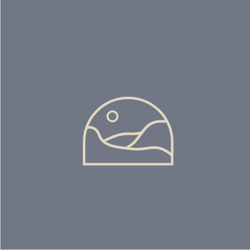
I chose the name scape candle co. from being inspired by travel and landscapes. This is where Scape came from. A candle company inspired by travel and the landscapes seen.
“Travel inspired candle company who scents are centered around landscapes found nature. They believe in inspiring others to enjoy the beauty earth has to offer all while keeping it eco friendly.”
BRAND IDENTITY
WINTER 2022
PASSION PROJECT
TYPE PAIRING:
I chose a name based around being “earthy”. Scape - Landscape. A travel inspired candle company. I knew to keep it simple I wanted to use only on typeface. I was looking for a typeface that was simple and sans serif.

DETAILS:
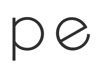
I played around with figuring out how I could add some details to the text while keeping it subtle. I tried adding in a simple element that was inspired but the wave pattern.
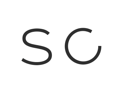
I landed on rotating the c and e since they were similar geometric shapes.
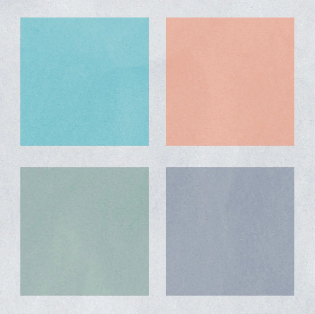
COLOR:
I tried a few different color options inspired by nature. Mountains, the ocean, and forest. I feel the colors were a bit too bright and not as earthy. So I used sand and fog as a transparent mask to add some depth and texture.
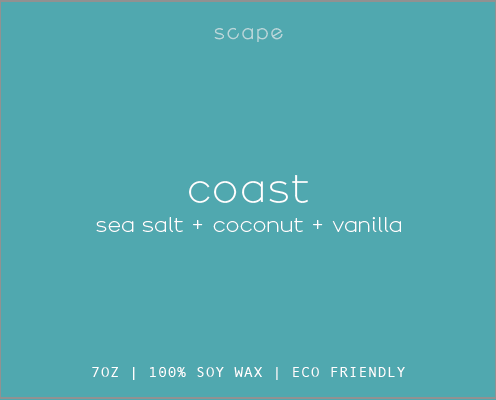

FINAL LOGO:
I landed on a muted blue color, brown, and light tan for a simple contrast. I felt this brand needed more to tell their story than just one logo.
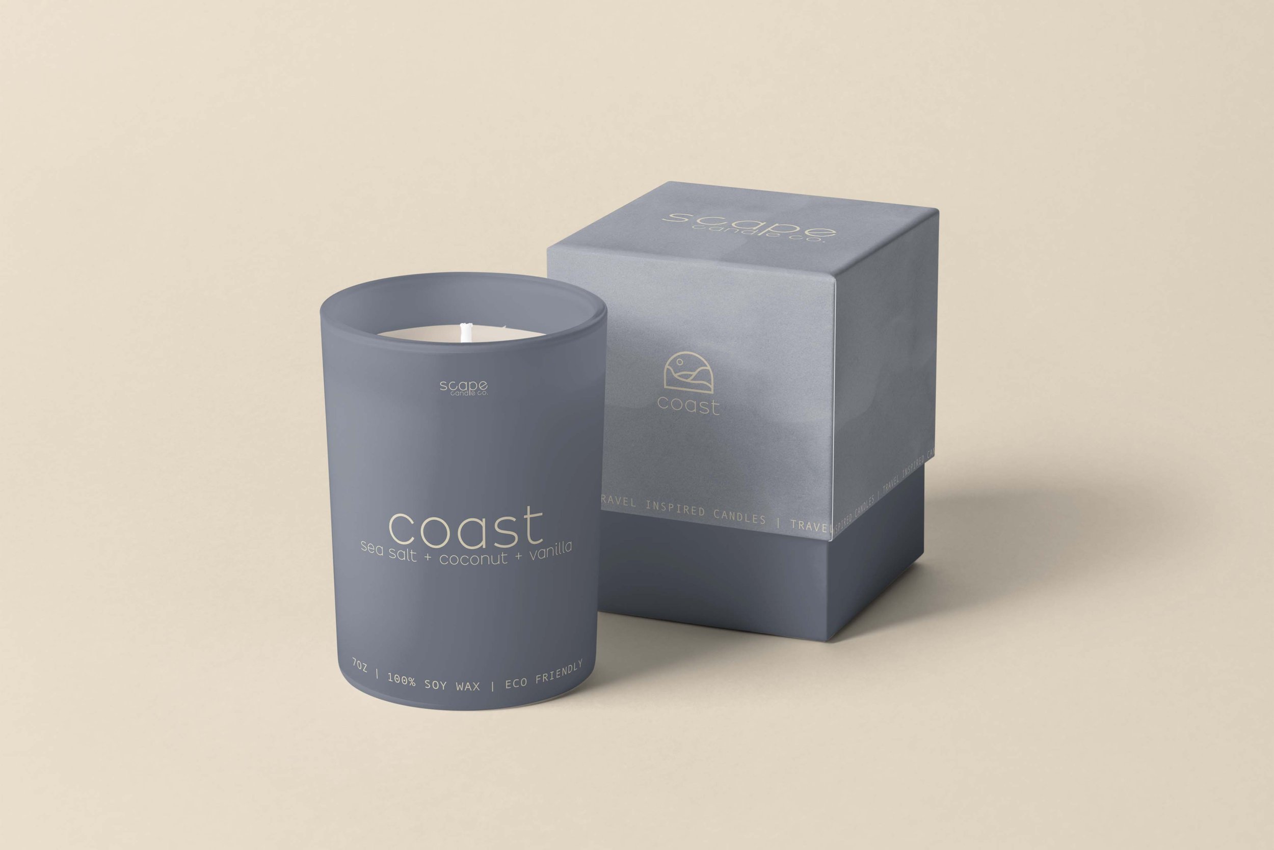
To show how it could be used in real life I included a mockup how how this logo would fit into packaging.