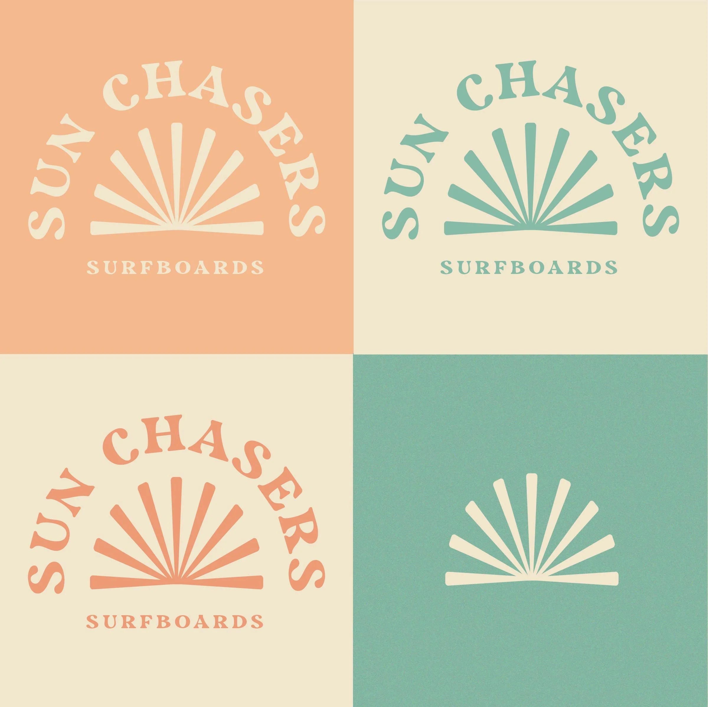
SUN CHASERS SURFBOARDS
Surfboard Company
chill + retro + portrait logo
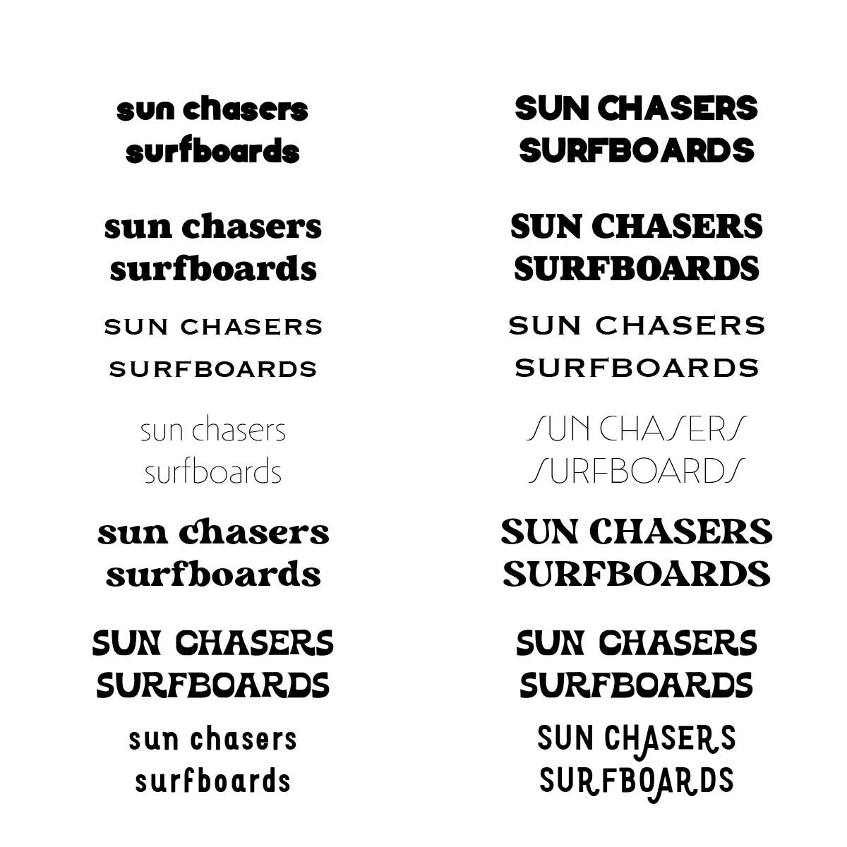
TYPE PAIRING:
I was drawn to these typefaces as they fit the retro chill groovy esthetic I was going for. I decided to start playing with them to see how they looked in a portrait logo.


DETAILS:
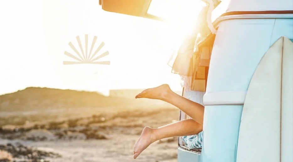
I was inspired by sunsets over ocean as an icon, to add to the portrait logo. I used this retro sun image as inspiration for the icon, I wanted it to have the feeling of the retro sunburst.
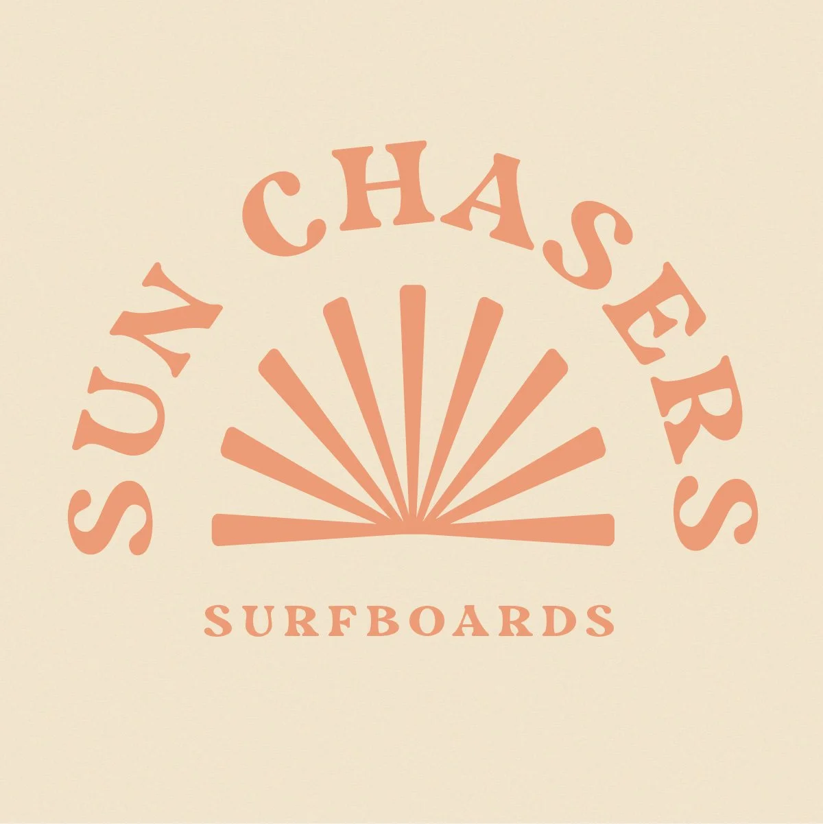
I moved away from a perfect circle to feel a little more retro, so I created more of an oval shape.


*The sun icon felt a little disconnected with harsh corners so I rounded them out to match the typeface strokes.
COLOR PALLET:
I was inspired by this picture of a retro van for the color pallet.