
INNER HEALING REIKI
REIKI
illustration + line art + whimsical

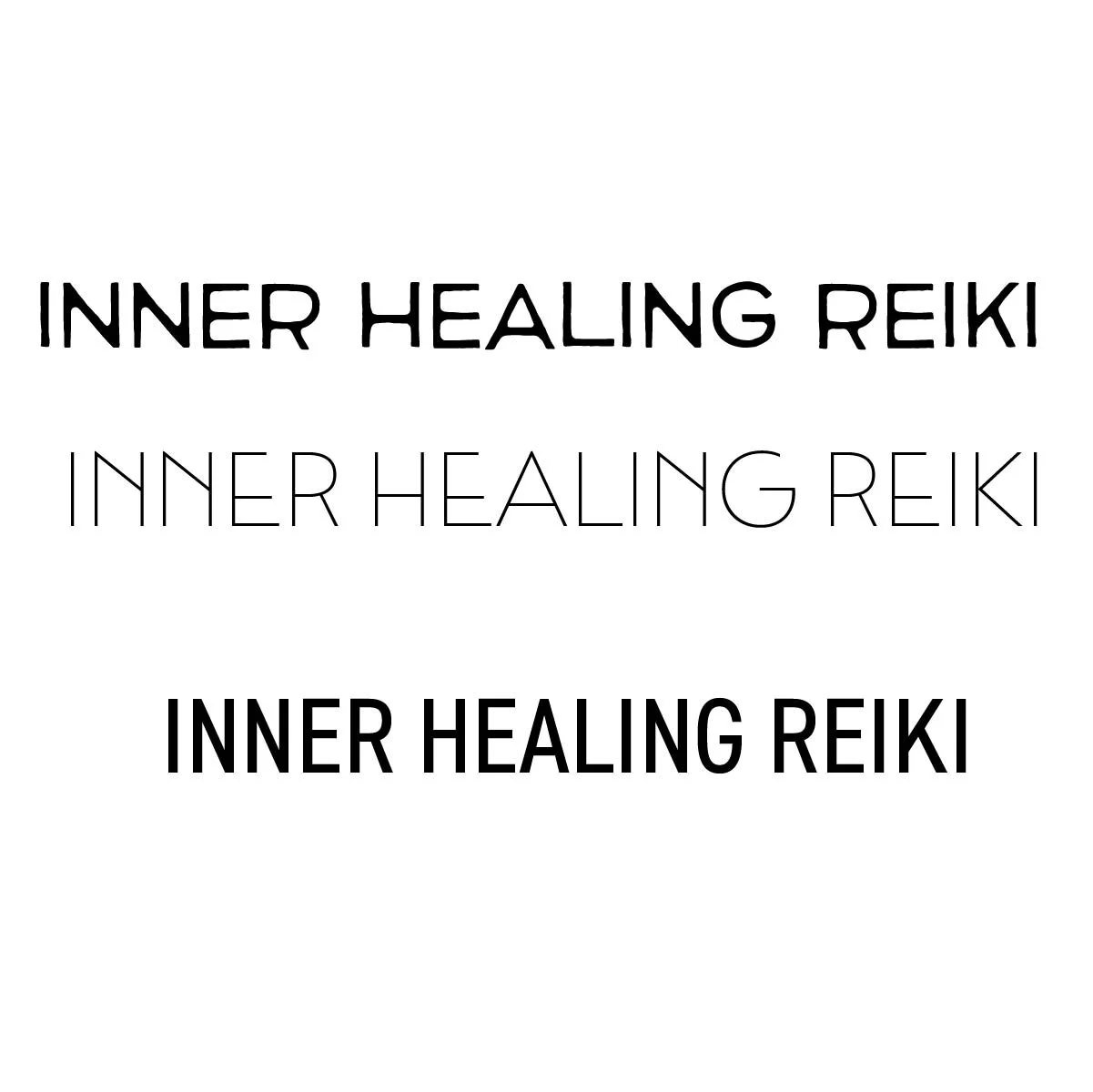
TYPE PAIRING:
I Was looking for a clean but unique typeface to compliment and look connected to the line art I would using in the future.
They felt simple clean and natural reflecting what Reiki is, which is energy healing technique that promotes relaxation, reduces stress and anxiety through gentle touch.
I landed on these 3 typefaces.

DETAILS:
I started playing around with and digitally sketching some layouts.
I made these elements through illustrator. I Chose to use the hand for the illustration part of the logo since reiki is energy movement by using your hands.
Sine the illustration was more vertical I changed my type shape from a circle shape to more oval.


LOGO DRAFT:
After applying my details here is where thee logo landed. I just needed to add color t finish it of.
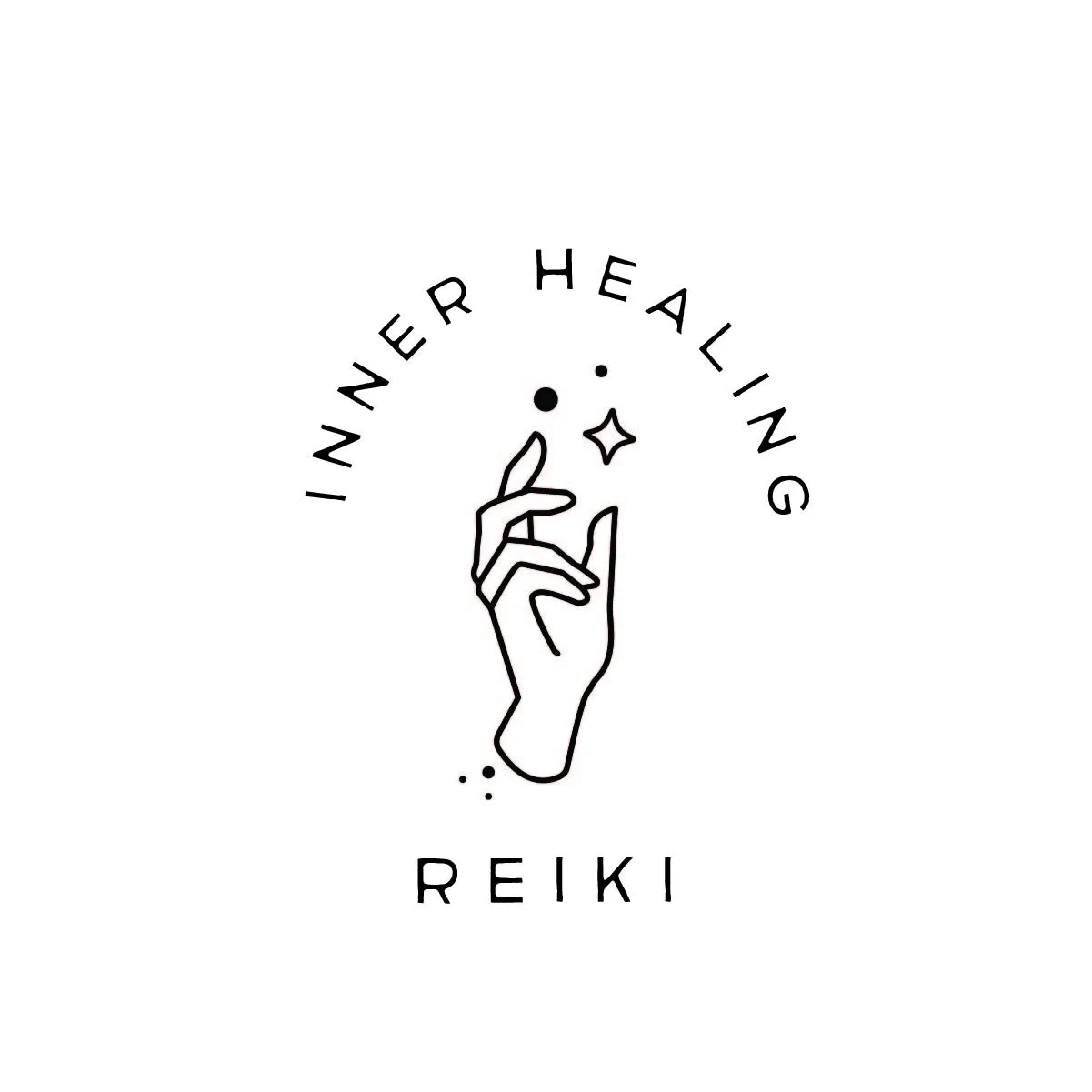
FINAL LOGO:
I landed on a muted green color and brown simple contrast. The colors don. take away from the logo but add a whimsical feeling as well.
