
SAMS SURF SHACK
WATER SPORTS
clean + inviting + illustration

TYPE PAIRING:
I went with a sans serif that had rounded edges to give it a friendly and inviting feel.

DETAILS:
I drew up a illustration symbol in Illustrator. I chose to create a line art surfboard to add that illustration element while keeping it simple. The color pallet is neutral and can be attracted by both male and female.

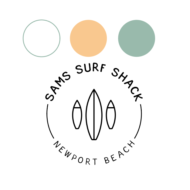

FINAL LOGO:
I added texture the background using a picture of sand and creating an overlay. By doing this it helped add some depth and a beachy feel to the logo.


