
DOUGLASS MEDICAL LEGAL
CONSULTING
elegant + professional + modern

TYPE PAIRING:
I was looking for a sleek modern typeface that still felt professional enough for a consulting firm.
Non of these felt just right once spelt out in the business name, so I played around with all uppercase to see if that helped before looking for more typefaces.
Chose this font bc i felt the g’s were more unique and I admired the contrast in stroke weights.
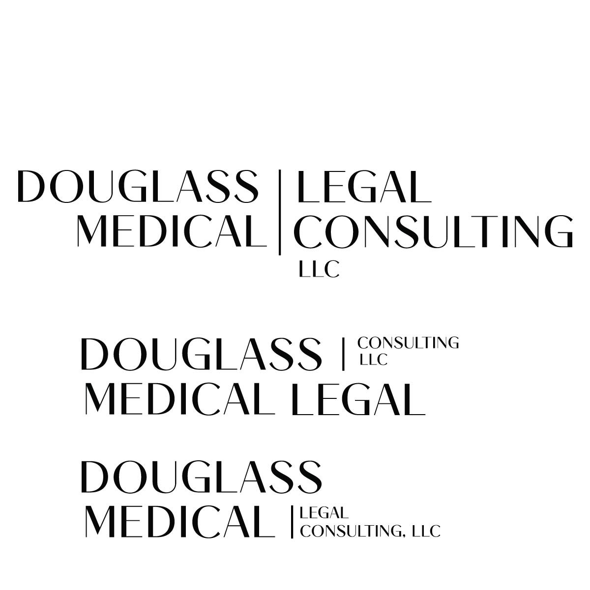
I then broke the words apart to play with some placement.


DETAILS:
I felt this top layout was little too horizontal.
I felt thee bottom layout shape of text is working but needed cleaned up.
These were 3 layouts I was playing with and as I took a step back I felt all 3 worked well together and were different enough and that a client in the professional field could use all 3 for different purposes.


LOGO DRAFT:
Seeing them all together I felt there was something missing in the typeface, it was still just a little too simple and not as elegant and modern that I was looking for and felt too professional.
I tried playing around with lower case because each letter had more detail but the words were not lining up correct without overlapping.


FINAL LOGO:
I landed on a logo with a dark brown tone. to keep it modern and professional.

