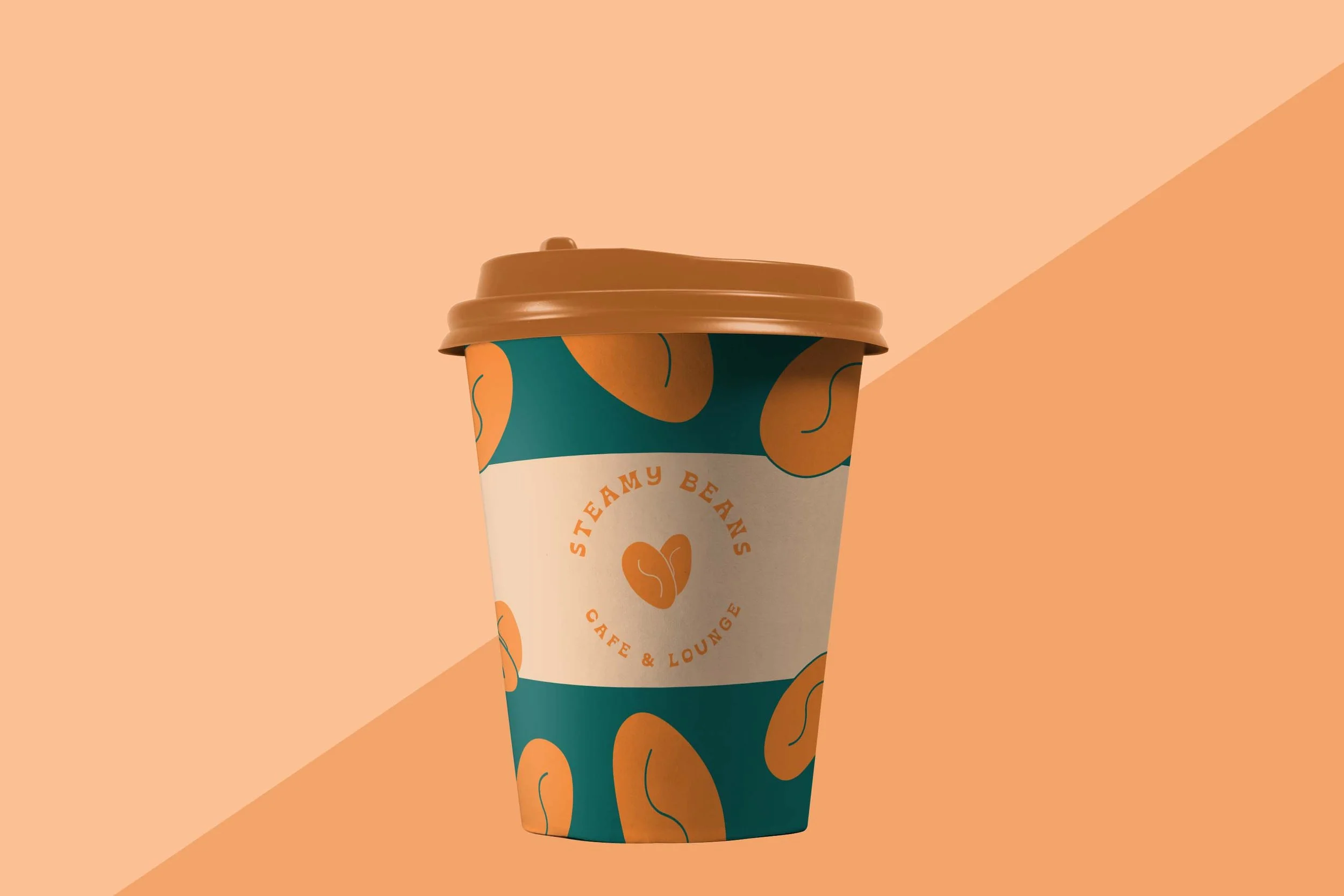
STEAMY BEANS
COFFEE CAFE
friendly + inviting + bold

TYPE PAIRING:
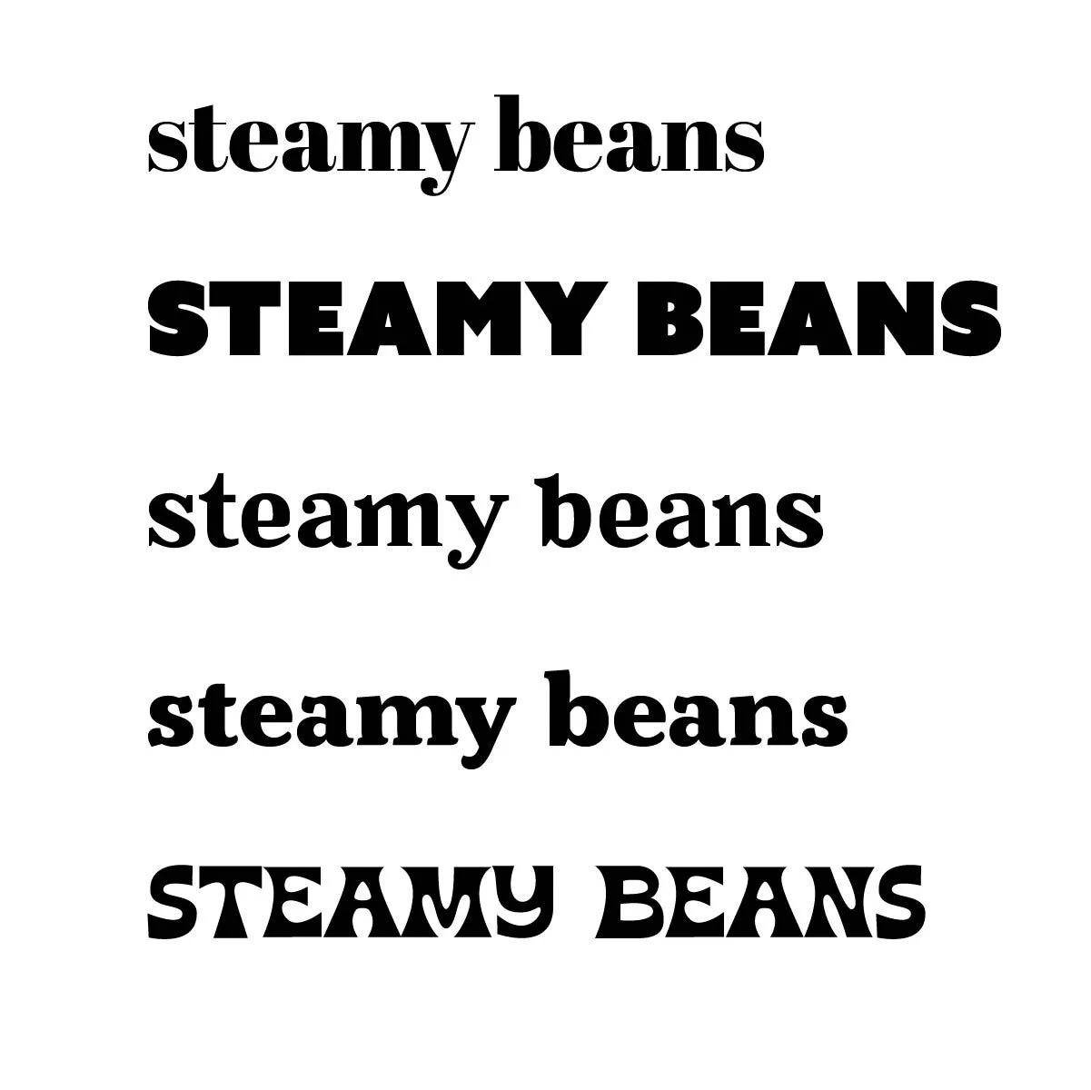
I was looking for a bigger stroked font to give a sense of boldness but still felt friendly.
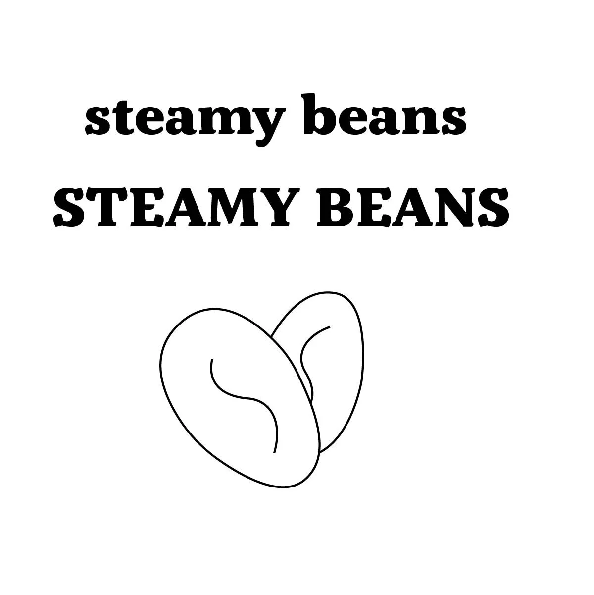
Chose this typeface because it had unique serifs. Wasn’t set on upper or lower case so I kept both to play with.
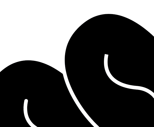
I created a quick illustration of a coffee bean to add a fun and friendly element,

DETAILS:
Once I started implementing the type with the bean and circle shape I didn’t feel the type was giving the feeling i was looking for or as inviting.
Felt better with this typeface and bean but the bean still felt off, I rounded the end caps of the line bean.
COLOR:
I chose colors that don’t typically reflect coffee or a bean such a browns and neutral colors. I went with contrasting but complimentary colors to give a bold punch!