
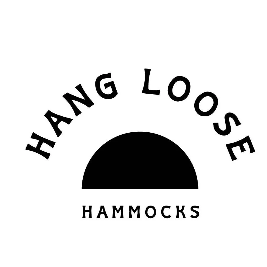
HANG LOOSE HAMMOCKS
HAMMOCK COMPANY
earthy + chill + clean

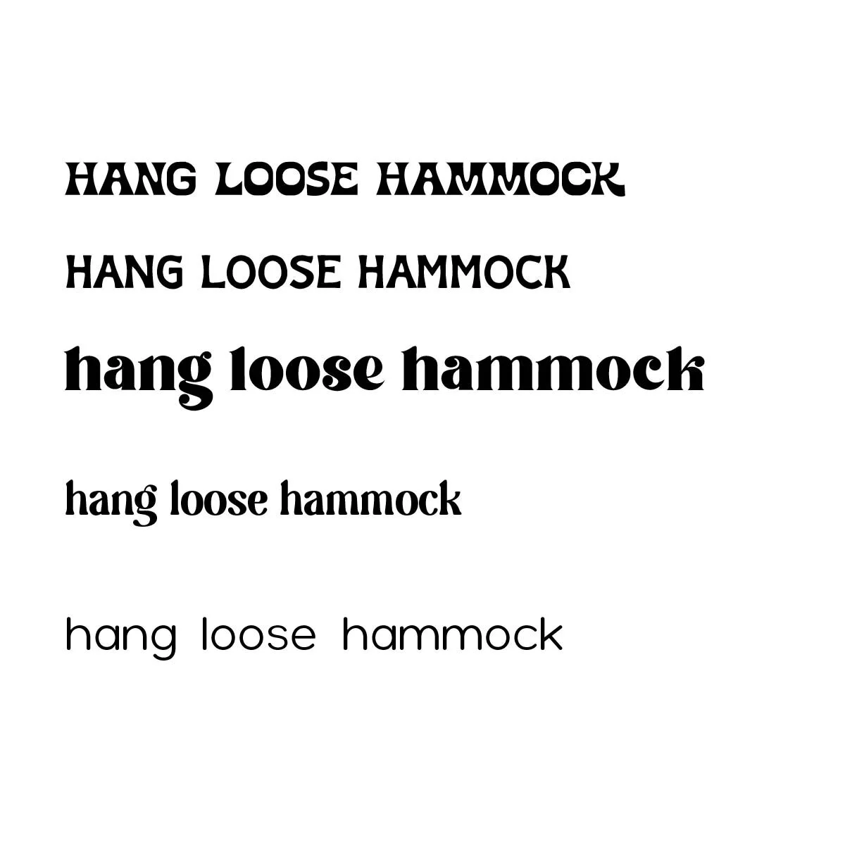
TYPE PAIRING:
I added in some glyphs to the last letters. I was drawn to the twirls and felt it was super “chill” and reflected the hammock name and “hanging” but it felt a little too stylized. Was going for more of a earthy calm font.
DETAILS:
Landed on this font because it was more simple and felt a little more natural.
I wanted a simple shape to add to the logo. I started drawing this before tarting to think about creating a shape with the font.
I added rounded corners to the end of strokes to be more cohesiveness with font.
Played aroUnd with this shape and the text, I did not come to a conclusion wIth it and felt very awkward so I made the shape more simple.


COLOR:
I chose a simple color palate to keep it simple clean and feel earthy.


