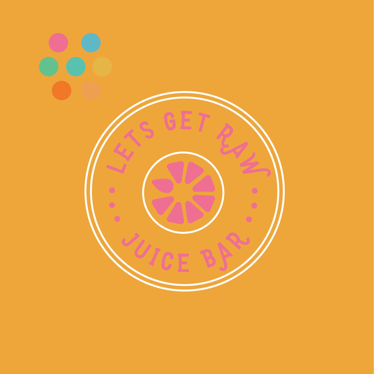
LETS GET RAW JUICE BAR
JUICE COMPANY
fun + friendly + playful

TYPEFACE:
I was looking for a typeface that had a quirkiness to it and was playful but also easy to read as its being a logo.
DETAIL:
I wanted to use an element that reflected things that are used in a juice bar. I created a fruit with shapes. I manipulated the shaped so it felt connected with the font and flowed smoothly. I did this by rounding corners and giving it an organic shape. I added in a liquid drop to one side fo it to give it some playfulness.
COLOR:
I chose colors to work were that were bright and had good contras from on another. After playing with color combo’s I realized some colors were inflicting on one another and harsh to the eye. I decided for the final logo to go with white font to contrast the bright and fun colors.
ARTBOARD:
This is showing all my work in the previous videos when finished. The logo to the right wit orange and pink is were I decided the colors clashed and using primary white for the typeface worked best.