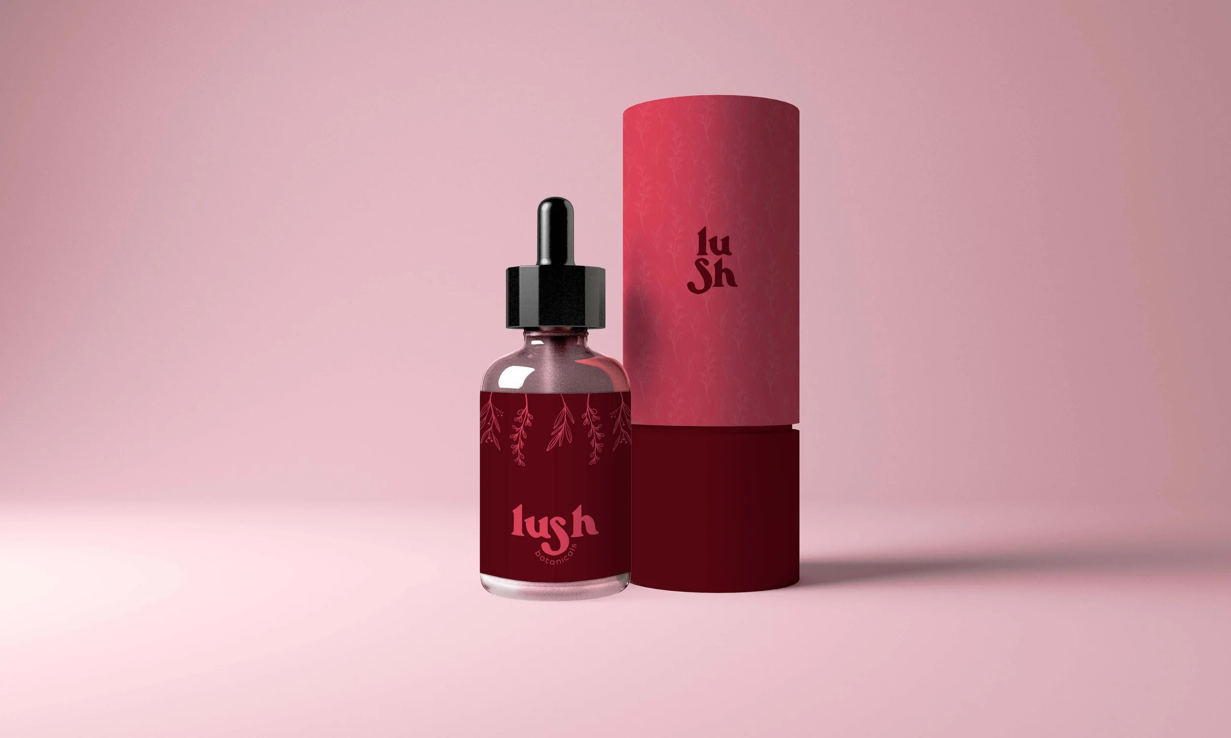
LUSH BOTANICALS
BOTANICAL COMPANY
flirty + feminine + bold

TYPE PAIRING:
I chose a typeface that was sans serif and had rounded strokes to give a soft feeling. I chose this typeface because the glyph on the “s” was playful and added character.

DETAILS:
I set a goal for this logo to create a primary logo, secondary, and en element. I wanted to challenge myself to create different layouts for this. I wanted them to all feel different and compliment one another but also different enough to have a reason for change.

COLOR:
I wanted to choose pinks and maroons to give a feminine feel but a contrast in color to feel bold and flirty.
FINAL LOGOS:
Here are the final primary logo, secondary, logo element, and pattern together.