LIQUID SUNSCREEN
SUNSCREEN COMPANY
colorful + clean + fun

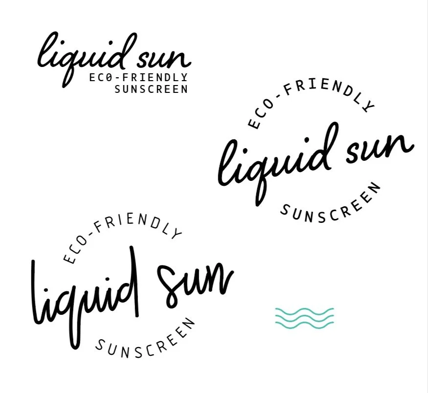
TYPE PAIRING:
I was looking for typefaces that felt free and natural like liquid- name reflects this as well. I knew for the secondary font I wanted a clean sans serif. I felt a nice clean and fun script font would look well.

LAYOUT CONCEPTS:
I jumped into playing around with some layouts .with my font choices. I decided on more of a circle layout to reflect natural and the sun.
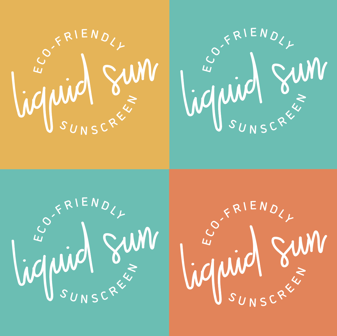
COLOR:
I chose bright and fun contrasting colors.
FINAL LOGOS:
Here are the final primary logo, secondary, logo element, and pattern together.