BOOCH KOMBUCHA
KOMBUCHA COMPANY
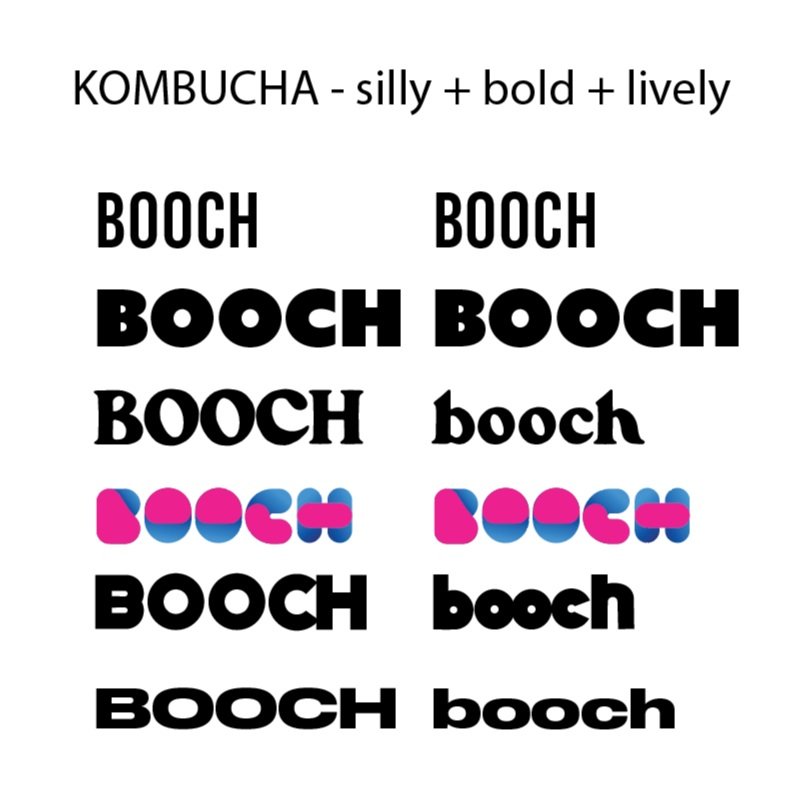
silly + bold + lively
TYPE PAIRING:
I was looking for a bold simple and geometric font that would be a good base to manipulate the letters to give the feeling of silliness.
DETAILS:
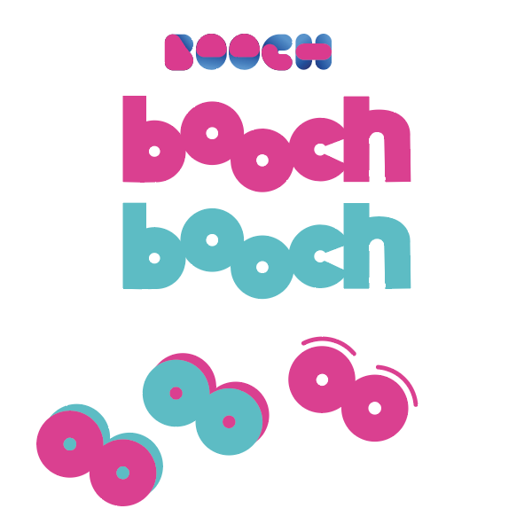
I played around with the “o’s” since they were geometric. I wanted to use these letters to give the logo some silliness with keeping the original name of the kombucha brand.

COLOR:
I drew inspiration from one of the previous fonts with the contrasting pink and blue bright font.
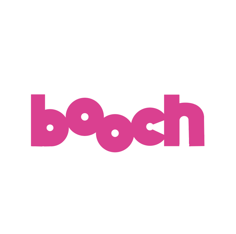
FINAL LOGOS:
How the logo would be used. I created 3 flavors blueberry, raspberry, and grape to show how the logo can be cohesive across the board.