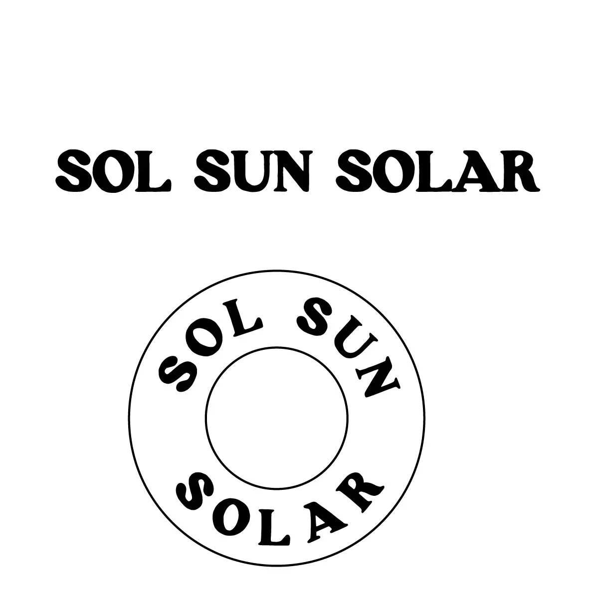
SOL SUN SOLAR
SOLAR COMPANY
15 minutes + nature + simple

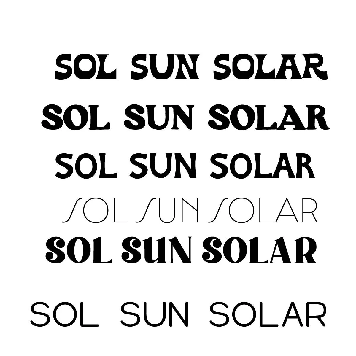
TYPE PAIRING:
I was looking for a sans serif typeface that was clean and easy to read but still had character to feel natural. This typeface felt it went with the feel of the brand but once put into a circle shape it felt disconnected.
DETAILS:
Chose this typeface bc the “O” was a perfect circle and felt aligned with the logo shape.
COLOR:
I chose a simple color palate to keep it simple clean but still contrasting colors.