SOAP & SUDS
SOAP COMPANY
retro + bold + lively

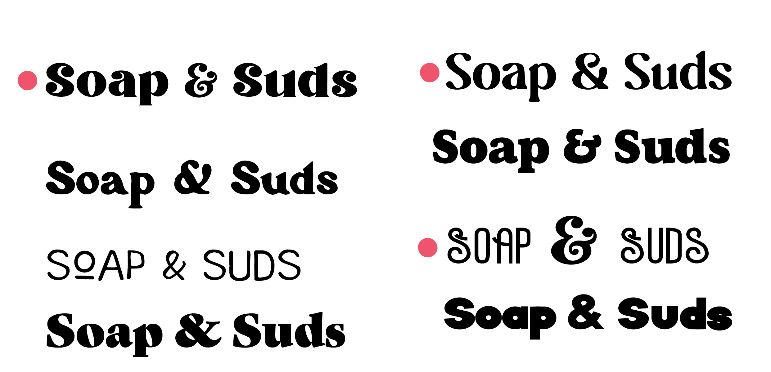
TYPE PAIRING:
I was looking for a fun and bold typeface to give some energy. I noted the top 3 I liked.
DETAILS:
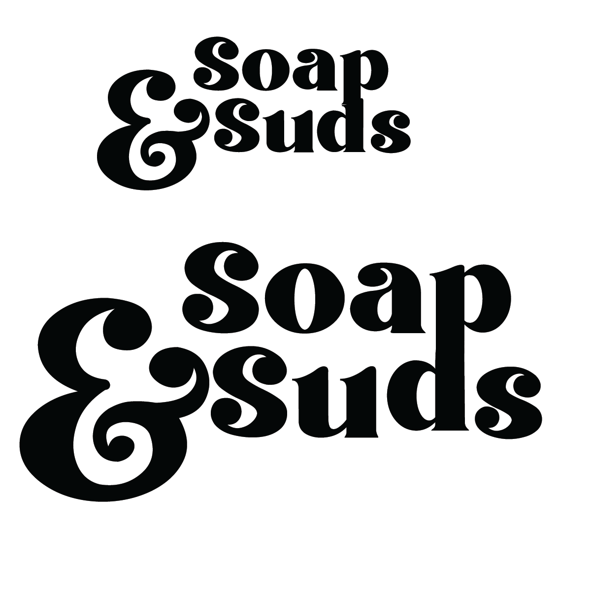
I noticed the p and d almost lined up so I make them shapes and outlines to manipulate them to connect
When I realized there were different glyphs I felt it was important to dissect each of them. I decided to add glyphs to these letters as well to give it more of unique pop.
The & sign felt a little heavy so I tried to see how it looked outlined. I decided to keep it as is and play with color as hierarchy instead.
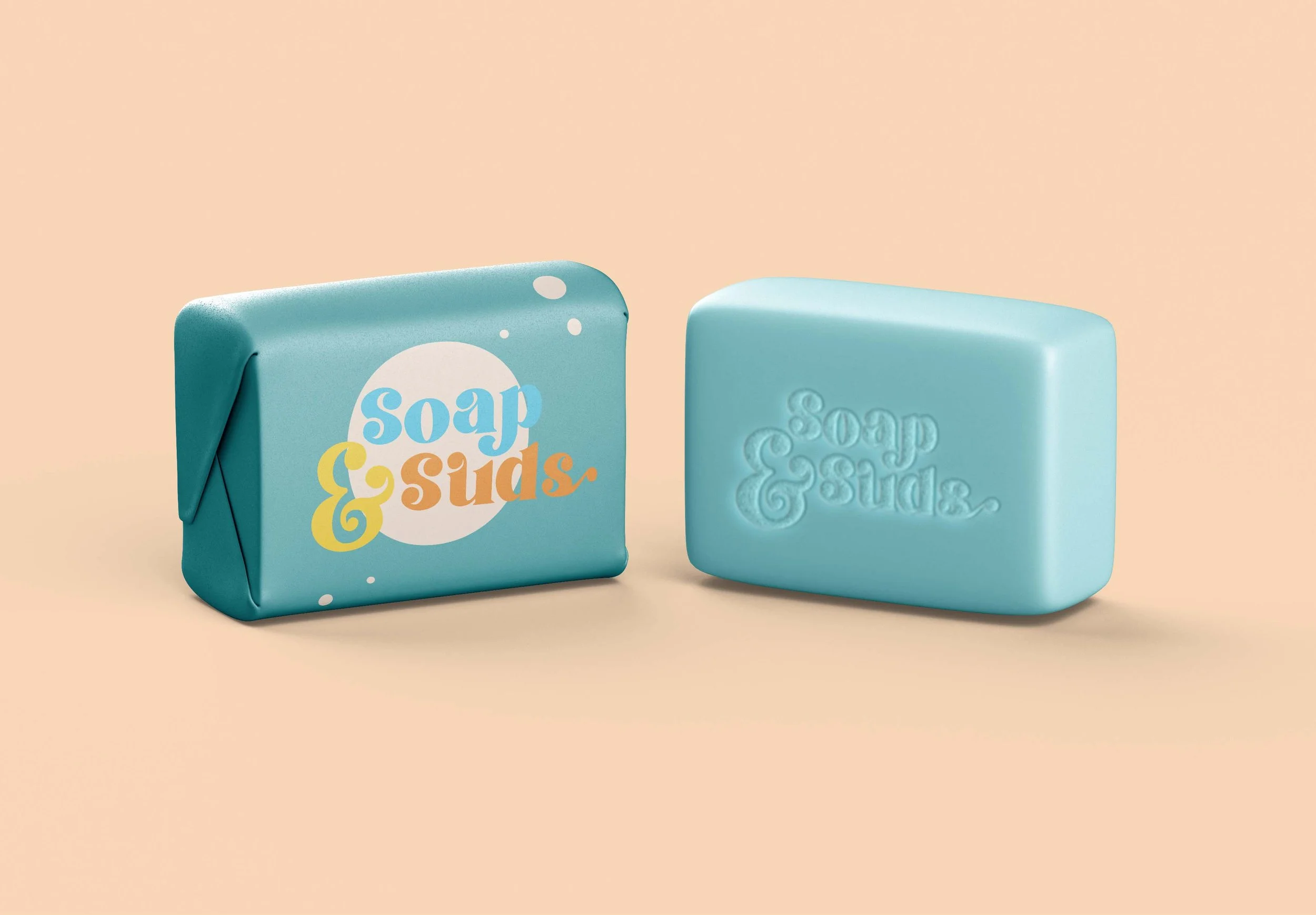
COLOR:
I decided to start choosing colors at random the felt bold and brith and started pairing them together.