ADVENTURE AWAITS NOMAD VANS
VAN COMPANY
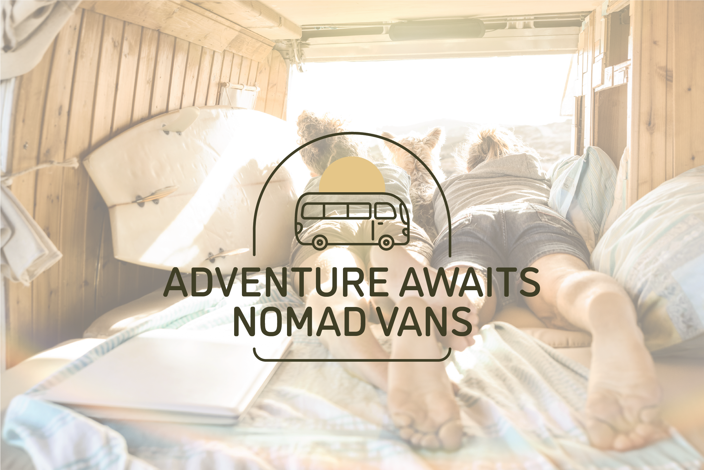
earthy + friendly + comfy

TYPEFACE:
I highlighted a few typefaces that felt earthy and friendly, I chose one and started designing with it and that is the typeface I ended up using. iIt is clean and still feels relaxed.
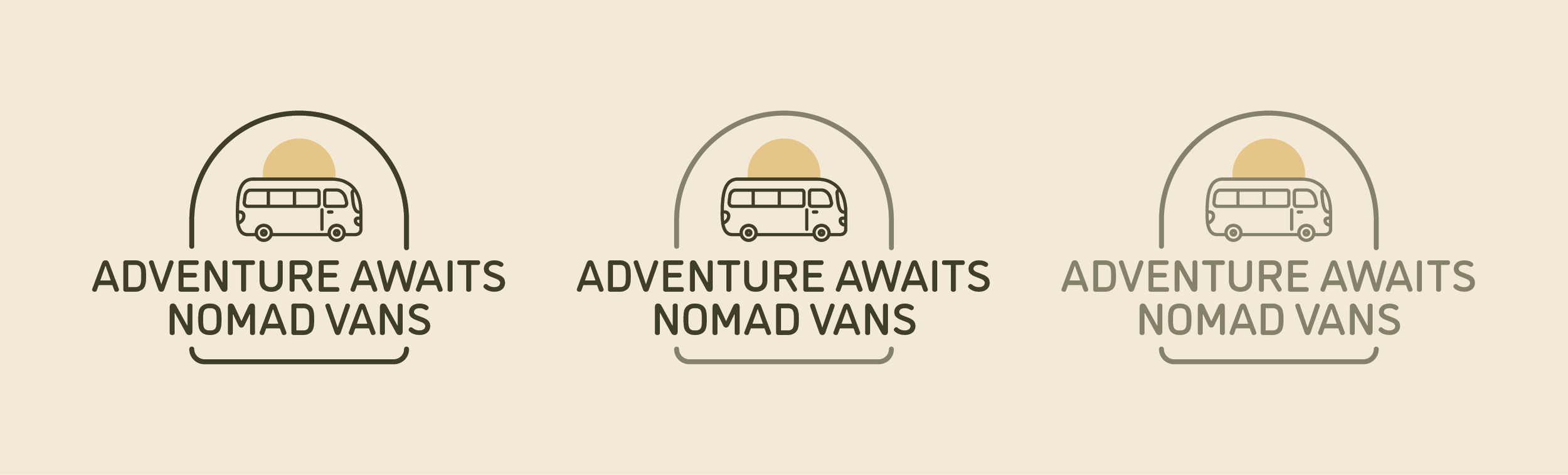
LAYOUT:
I played around with layouts that felt earthy by using circle shapes and ovals. I landed on a layout shape that felt more like a landscape or portrait by using rounded corners to feel less intense and more “friendly.”
COLOR:
I chose colors that would be seen out in the nature but still felt neutral, not too masculine. The brown and greens I felt fit that description.