
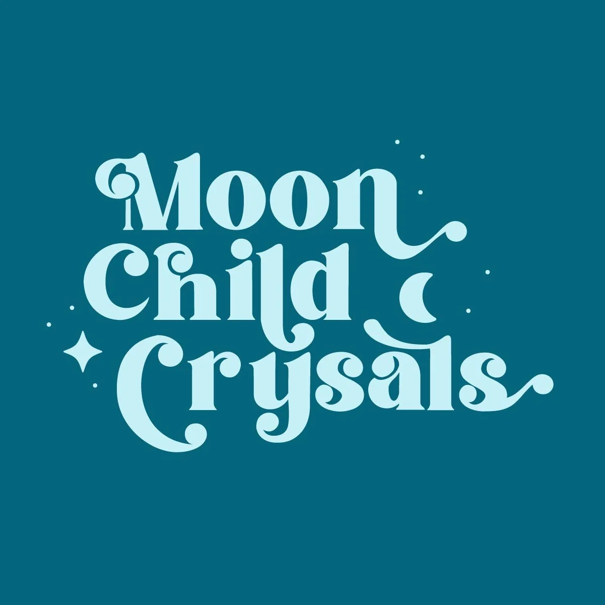
MOON CHILD CRYSTALS
CRYSTAL SHOP
whimsical + stacked logo + 15 minutes
TYPE PAIRING:
The first typeface felt more fun and whimsical.
DETAILS:
Started playing around placing them in a way that felt comfortable and nestled together.
I created some elements that felt whimsical and something you would see in a crystal shop space.
COLOR:
I chose a few colors that reminded me of crystals and the mystic nature behind them.


